Luchsinger Lane Home Tour Part I
It’s that time of year again, the time where we’re all snuggled in and nesting with the family. The holidays feel like they’ve long passed and you’re left with the holes where all the holly jolly Christmas decorations twinkled.
That was fine for a few weeks – it felt almost like a cleansing, because it was all so simple, back to basics, a blank slate – but now, all those glaring to-do lists that were staring at you at the end of last spring? Well, they’re back, back with a vengeance, in fact, and they’re starting to annoy you once more.
We know how you feel. We’re in the same boat at Teaselwood Farm. Therefore, we’re gearing up and getting excited for some upcoming projects around our own house! First up: the living room. Don’t worry, we’ll be sure to post our progress over the next few months.
For the time being, however, we thought we’d take you on a house tour through one of the prettiest homes we’ve had the pleasure of working on. You know, to help curate your creative juices and inspiration boards.
Our home story begins with a sweet, creative client who came to us with a baby in tow, needing to infuse her home with her family’s beautiful personality. This client at the time was also in the process of opening a quaint boutique that required a few finishing details. We hit it off imediately and embarked upon the creation of a home that truly fit her and her family’s individuality and needs.
While the house had all the right rooms, it was basically a blank canvas. The biggest culprit was the vast double story entry space. Thus, that is were we started our interior design journey.
First, we picked a tone-on-tone large scale print that you can just see around the edges of the door in the above photo. This instantly added personality as well as detail to the entrance, showing visitors what fun was in store for them.
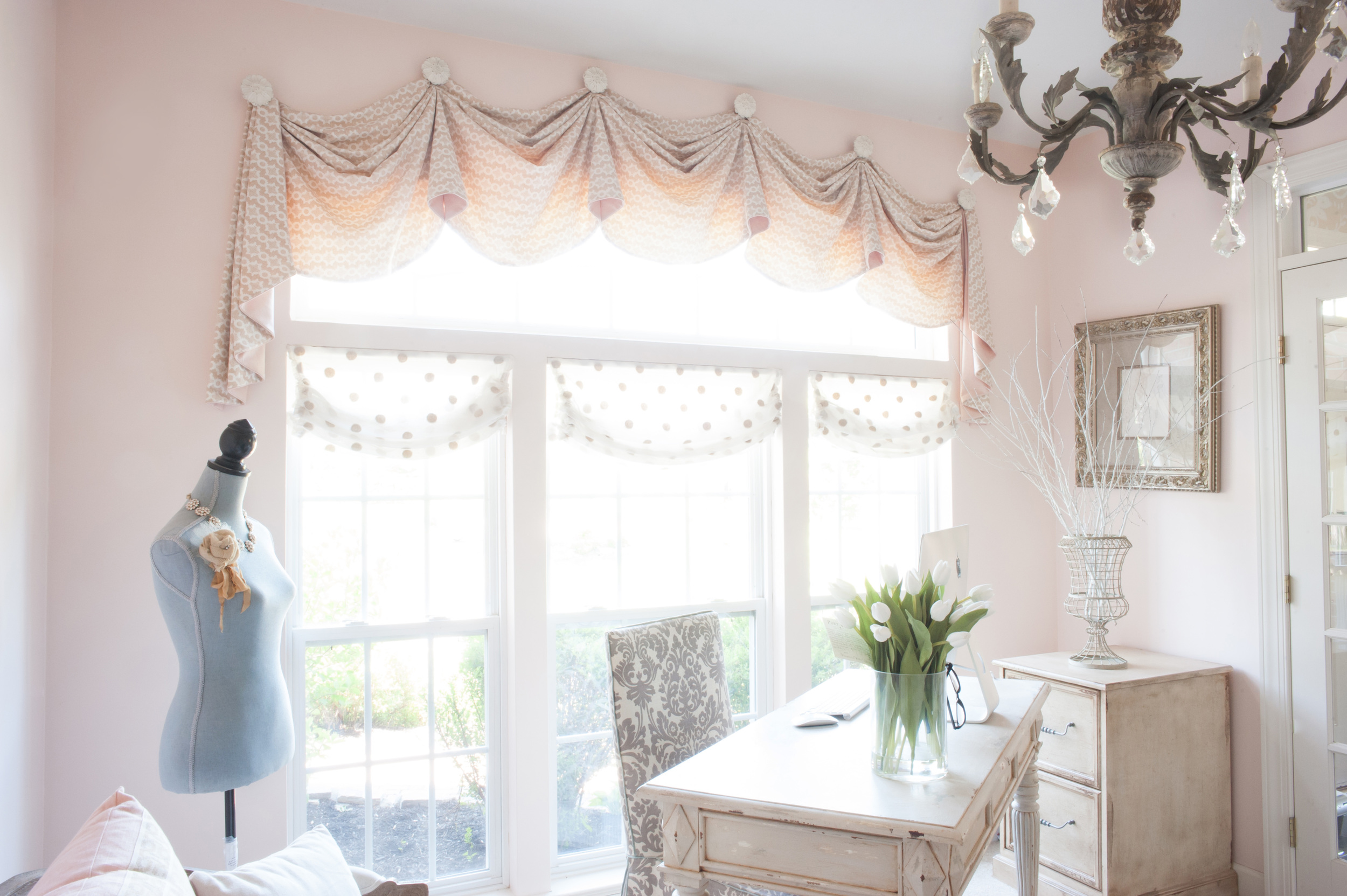
Next up, the room off the entrance, the office space, which was filled with big, dark furniture. We gave this space a huge facelift and brightened it up considerably, adding a good dose of feminity not often seen in home offices. And – sidenote – the space has worked out perfectly for the family as a little cove where mom can run her business and the kids can jump on the computer to do their own work.
We had some fun with the window treatments, designing them to not only show off the windows but add some interest and depth as well.
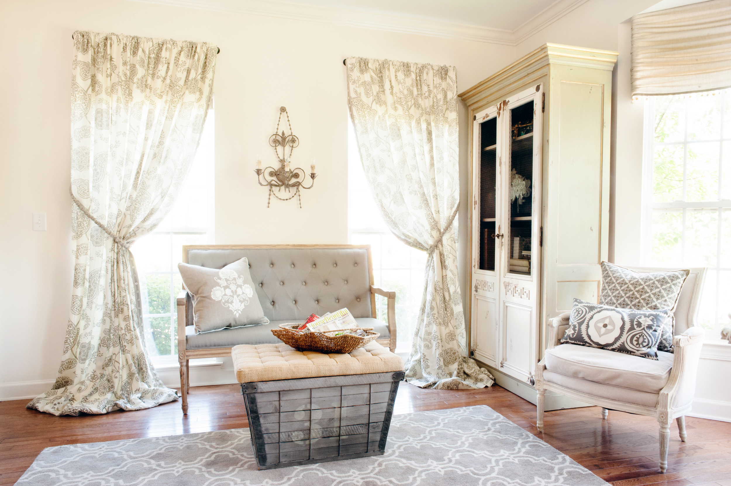
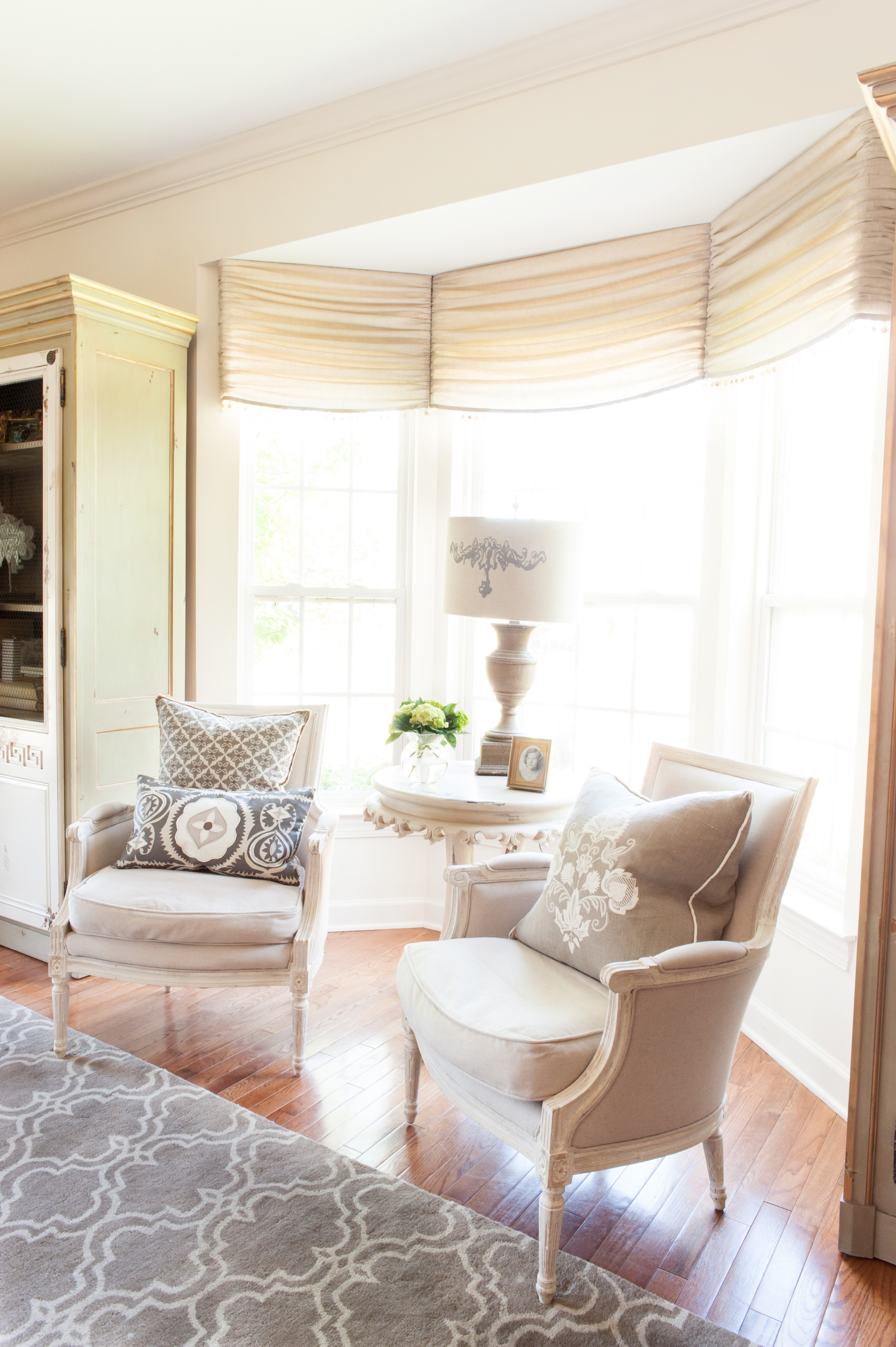
Next up? The sitting room across from the office. It took a bit to wrap our heads around this as our client did not want a formal living room. We instead transformed it into a library/sitting room where grown-ups could gather to gab after dinner. It’s also a music room of sorts. We left the floor space open to allow the kids to use the room for games and the occasional bounce house. (*cringing. Just be careful of the beautiful antiques, kids! We jest. Kind of.)
The window treatments set the stage for this room: They established the desired mood and really warmed up the space.
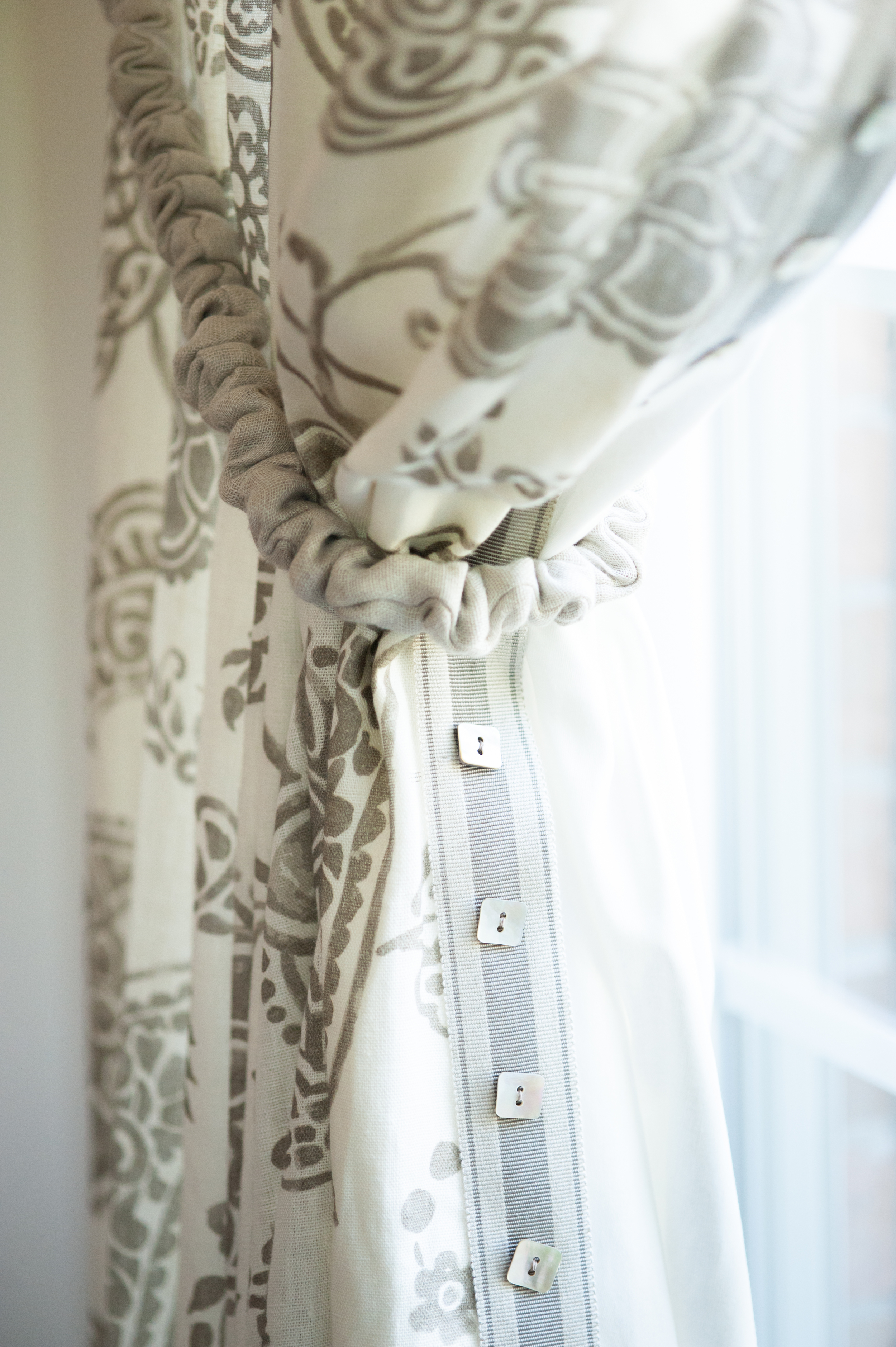
One of the wonderful things about our window treatments in general is that you can add as little or as much detail as you like to them. Whatever suits your personality and your vision for the room.
We personally love to add interesting trims and details to our treatments so they really stand out in the room.
We’re over-the-moon pleased to say the homeowner adored our idea of “farmhouse meets shabby chic” style peppered with lots of painted, distressed furniture pieces (something that we, too, love).
We thoroughly enjoyed showing you this space! We hope you loved it just as much. If so, get ready for Part II in the next post.
XOXO,
Charity
Photos: Alice G Patterson Photography


