Luchsinger Lane Home Tour PartII
Oh hi there. Let’s skip the small talk and pick right up where we left off, shall we?
OK, OK. A teeny recap in case you missed our last post: Part I featured the beginnings of a tour through the home of one of our super fun, talented clients. We launched said tour last week with her home office and sitting room. This week, we’re pedaling forward with three more fantastic spaces: her morning room, parts of her living room and her daughter’s room. Ready? Here we go.
Room 1: The morning room. Sounds wonderful, doesn’t it? “Morning room” evokes scenes of the summer sun rising, a mug of hot coffee cradled in your hand, silence throughout the house as everyone else (read: the kids!) is still asleep. Every house should be built with a morning room. Anyway, as our client’s morning room opens to the kitchen and family room, we needed to both tie it together to the rest of the house and give it its own sense of space. With this duet of a goal in mind, we painted the walls a subtle pale blue and added a killer chandelier. The one challenge that we faced was keeping the dining room set, per the client’s wishes. But. We found a loophole. She said nothing about keeping the dining room set in the exact same state it was in… Would you believe that there are heavy leather chairs under those beautiful slipcovers?
Once again, the beauty is in the details. Details such as the multi-fabric, damask print slipcovers shrouding what was once dark, heavy leather. The covers offer the chairs, and moreover, the room itself, so much more interest, charm and softness. Plus, the window treatments we chose add another dimension, another layer, softening all the vertical lines in the room.
This sweet wicker set is something that was already in place and was perfect for the space. We just recovered the cushions to give them a fresh look and one that meshed well with the new color scheme.
Next is the living room. A work in progress, really. When we arrived on the scene, our client had crazy-heavy window treatments that blocked out all the natural light. We knew full well she wasn’t a vampire, so we helped her shed a little light into the beautiful cave. What did the trick? Stripping the windows and creating light linen treatments on the same drapery hardware that the original treatments were on. Reusing what she had kept costs down as well, which is always a plus. We painted the room a light beige/gray color and added this fun wing chair.
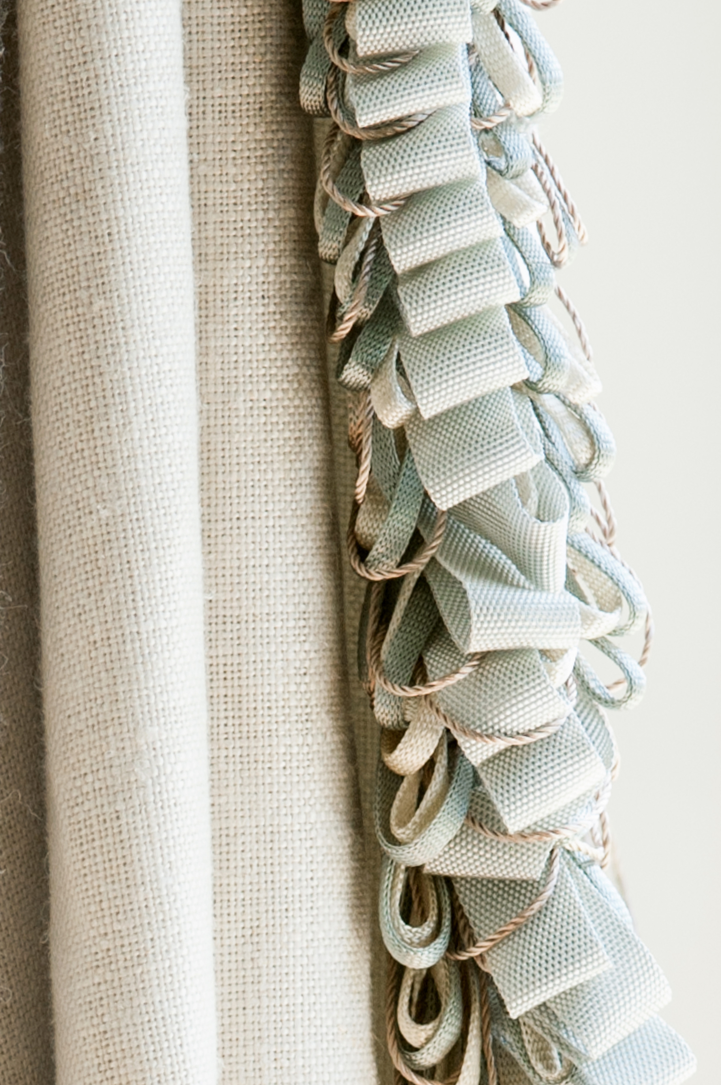
Here is a close up of the window treatments with the adorable, loopy trim detail.
Room 3: Her daughter’s room. I have such fond memories of seeing this munchkin arrive the first time at our studio, in a baby carrier, no less, and have been so fortunate to watch her as she has grown. Our mission was to create a room that will grow along with her – but not something so over-the-top that she will become tired of it. Therefore, we custom-designed a headboard with her monogram, a sentimental piece that can be used even when she becomes an adult and moves into to a place of her own. It’s detailed with a contrast welting that really shows off the shape.
The window treatment is a fun striped silk with tiny bead detailing. Its shape is pretty, girly and flouncy, yet, most important, one that will stand the test of time, achieving our original goal.
Hope you have enjoyed our tour, you can check out more inspiration in our portfolio at Teaselwood Design
XOXO,
Charity
photos: Alice G Patterson Photography


