Client Project Reveal: Village Charmer Kitchen Addition
I’d say the number one complaint I hear most often from homeowners about their homes is that their kitchens are too small.
And who can blame them?! No one wants to cook and wash dishes day in and day out in a space that feels like a closet.
Historic homes are particularly bad about this. Sometimes the kitchen feels like a tiny afterthought because it was hastily added on when having a detached kitchen house went out of vogue. But the real problem is that they just weren't built for we use our kitchens now. Back then, it was just a utilitarian room, but in our modern lives, cooking is as social as eating, the kitchen is replacing the dining room as our main eating space and everyone gathers there all the time because we see it as the heart of the home.
The Skaneateles area is full of the most beautiful historic homes with space-challenged kitchens just like our clients’. When they first came to us, these homeowners were tired of living with their dark, cramped, tiny kitchen. It was closed in and separated from the other public rooms in the house and they wanted to make it a space that suited how we really live today.
The solution? Open up the existing kitchen's walls, add on and give the whole space a new look that honors the home’s roots.
And that’s exactly what we did!
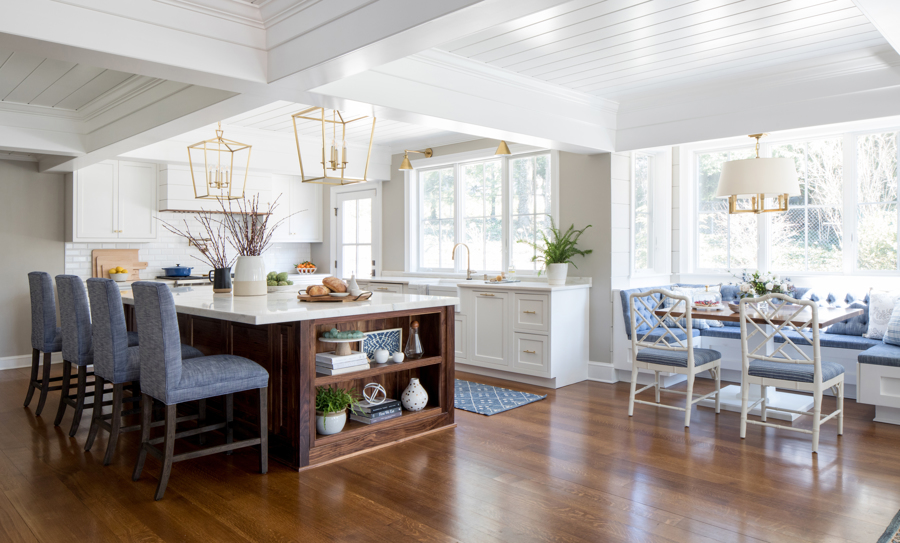
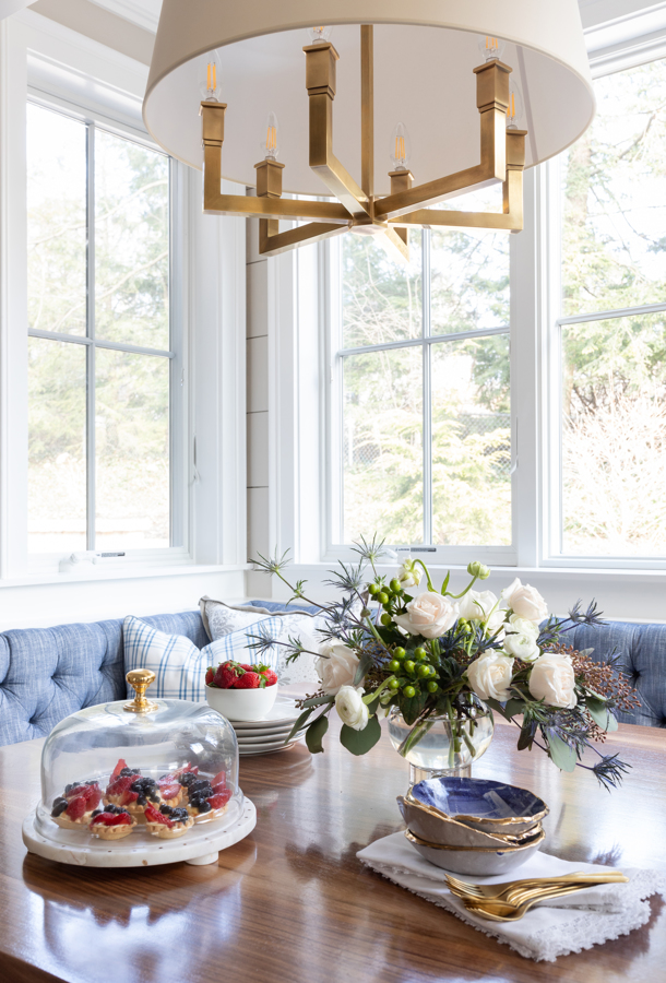
We not only created a much larger, brighter cooking space, but also a cheery breakfast nook, a cozy sitting area ( I love that in a kitchen - just look at this one and this one!) and storage for the homeowners' wine collection. By laying out the space just so, we also created a much better flow into the dining room and the rest of the house.
The centerpiece of the new kitchen is the large custom kitchen island, made from a richly stained walnut and topped with a gorgeous quartzite that looks a lot like marble, but will stand up to use much, much better.
We had the wide plank white oak flooring extended throughout the addition, then stained the new wood to match the existing floor.
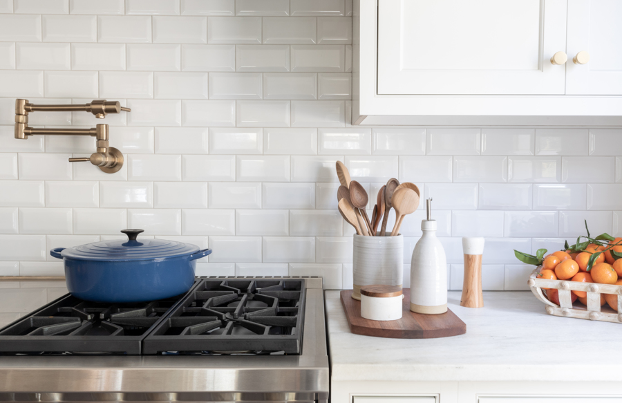
The whole space gets tons of style and visual interest with a mix of hardware, and the super stylish light fixtures add sophistication.
We gave the homeowners an appliance garage next to the wall ovens so they can tuck away the toaster, the mixer and more. Do. Not. Forget to add one of these to your kitchen renovation wish list! It's a little detail that makes a huge difference in keeping your kitchen tidy on a daily basis.
By building the breakfast nook into the bump out window space, we left room open in the main kitchen area for that oversized island and four barstools.
The addition gave us a roomy sitting area, so in went a new sofa and two of the peppiest blue plaid chairs you ever did see. They make me happy!
We wrapped the cabinets all the way around the corner to create a clever bar area. Wine storage and an ice machine, along with generous storage for glassware and a bar sink, are perfectly positioned for hanging out as a family or for entertaining larger groups. Handy dandy!
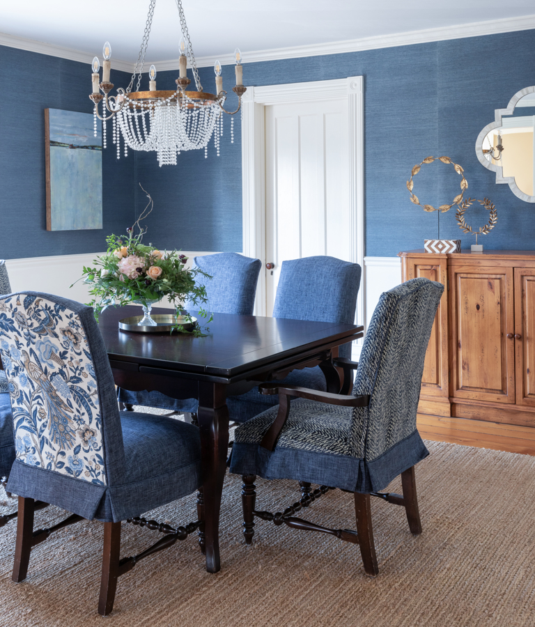
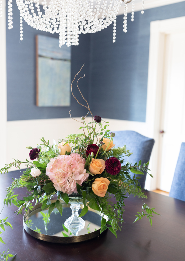
Here’s the view from the newly redecorated dining room into the kitchen. See how it all flows together visually? That’s mostly thanks to the blues we carried throughout both spaces.
No more complaints about this kitchen being too small! Now our happy clients can cook, eat, gather and relax together in their new spacious addition.
Do you suppose that one day a long, long time from now, people will complain that our 21st century homes had kitchens that were just way too light, bright and roomy. Then maybe instead of asking for kitchen additions like this one, they'll be asking for "kitchen subtractions?" Ha!
All Photos: Raquel Langworthy Photography
Flowers: Teaselwood Design
Dining Room Floral: Fleur De Lis Floral Design Skaneateles N Y
Pottery: Farmhouse Pottery Woodstock Vermont

